OK, so the headline is a little strong. I can't know the future, of course. However...
100% of the time – over the past 90 years – stocks have been higher after going through what they just went through.
Can you name another indicator that has called the market correctly – 100% of the time – over the past 90 years?
So while I can't predict the future, looking at the past provides a clear picture after situations like what we just went through in the markets...
First, I'll show you the track record. Then I'll explain it.
|
Signals |
Return |
Return |
Return |
|
Average Gain |
4.7% |
7.3% |
13.1% |
|
% Positive |
100% |
100% |
100% |
|
Source: SentimenTrader.com |
What we just went through was pretty extreme...
The market had its worst week in more than a year – after hitting a 52-week high.
My friend Jason Goepfert of SentimenTrader.com looked back at every time this had happened before in history.
He was looking for one specific condition: the worst week in a year, occurring immediately one week after a 52-week high.
As you might guess, this hasn't happened a lot – only 10 times, to be exact (not counting this latest occurrence).
Jason is conservative in his "play calling." So it was interesting to read his enthusiasm after these results. Here's what he said...
All 10 signals led to a rebound over one to six months, and the risk versus reward was ridiculously skewed to the upside.
There was almost no downside risk on a closing basis, while the rebounds tended to be very strong.
This is one of the most skewed risk/reward ratios we've seen in any study in recent years.
I can't be 100% certain that stocks will be higher six months from today. But based on Jason's homework, history paints a pretty compelling picture. (I highly recommend you check out Jason's excellent work at SentimenTrader.com.)
Sure, it would be great if we had more than just 10 occurrences over the past 90 years to hang our hats on. But this indicator is 10 for 10 so far. And as Jason said, the reward versus risk was "ridiculously skewed to the upside."
Today is more of a "buy" than a "sell" based on indicators like this. Follow your trailing stops, of course. But don't get spooked out of the market. I believe there's still plenty of upside ahead...
Good investing,
Steve
Further Reading:
Jason isn't the only one expecting higher stock prices. More investors are bullish than ever before, too. Yesterday, Brett Eversole explained what that means for the market going forward. Get the full story here.
If last week's market turmoil made you uneasy, there's a huge problem with your portfolio. "Monday was a 4.1% move lower. It wasn't a bump in the road," Porter Stansberry writes. "It was barely a ripple on the calmest lake the equity markets have ever seen." Read more here: Did Monday's Market Action Make You Panic?
Despite the recent correction in stocks, history says more gains are likely from here. And Dave Eifrig likes this retailer to take advantage of the upside...
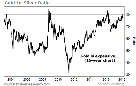
THIS RATIO IS STRETCHED TO ITS EXTREME
Today's chart highlights an extreme in the precious metals sector...
Regular DailyWealth readers know that we often like to measure assets in different ways. A simple chart will often tell you a lot. But sometimes it's a good idea to measure one asset against another. These "ratios" can provide a different perspective.
One that we often look at is the gold-to-silver ratio. A rising ratio shows that gold is expensive relative to silver, and a falling ratio shows that gold is cheap relative to silver. The gold-to-silver ratio historically moves between 50 and 70. But today, it's trading much higher...
As you can see below, the gold-to-silver ratio climbed to more than 80 last week. That means that right now, it takes 80 ounces of silver to buy one ounce of gold. The ratio has only been this "stretched" a few other times in history. This extreme reading suggests that silver is a better value than gold today...